 Format and Accessibility
Description
Game accessibility is giving as many players as possible the best opportunity of completely experiencing a game. Video game accessibility is considered a sub-field of computer accessibility, which studies how software and computers can be made accessible to users with various types of impairments.
Guidelines
| # | Guideline | Description | Example | Example reference | Applied to Readistance |
|---|---|---|---|---|---|
| 1 | Content is clearly structured and facilitates overview and orientation | The content is clearly structured and facilitates overview and orientation guideline suggests that the content or materials included in the game or product are organized in a clear and logical way, and are designed to help players easily understand and navigate the game or product. This means that the content should be structured in a way that is easy for players to understand, and should be presented in a way that allows players to easily get an overview of the game or product and understand how it is organized. By organizing the content in a clear and logical way, designers can create a more immersive and engaging experience for players, and can help to ensure that players are able to effectively interact with the game or product in a way that is meaningful and satisfying to them. It is important to consider the specific goals and objectives of the game or product, as well as the needs and abilities of the target audience, when designing the game or product to include clearly structured content that facilitates overview and orientation. | — | — | no |
| 2 | Content has a consistent labelling format | The content has a consistent labeling format guideline suggests that the content or materials included in the game or product should be labeled in a consistent way, using a format that is clear and easy for players to understand. This means that the labeling of content should be uniform and consistent throughout the game or product, and should use a format that is clear and easy for players to understand. By using a consistent labeling format for the content, designers can create a more immersive and engaging experience for players, and can help to ensure that players are able to easily understand and interact with the game or product in a meaningful and satisfying way. It is important to consider the specific goals and objectives of the game or product, as well as the needs and abilities of the target audience, when designing the game or product to include content with a consistent labeling format. |

|
https://www.friv.com/z/games/fireboyandwatergirlice/game.html | no |
| 3 | Link targets, functionality and general interaction are predictable | The link targets, functionality and general interaction are predictable guideline suggests that the links, functions, and general interactions included in the game or product should be predictable and easy for players to understand and use. This means that players should be able to easily predict the outcome of clicking on a link or using a function, and should be able to easily understand how to interact with the game or product in a general sense. By including links, functions, and interactions that are predictable and easy to understand, designers can create a more immersive and engaging experience for players, and can help to ensure that players are able to effectively interact with the game or product in a way that is meaningful and satisfying to them. It is important to consider the specific goals and objectives of the game or product, as well as the needs and abilities of the target audience, when designing the game or product to include predictable links, functions, and interactions. | — | — | no |
| 4 | Multiple navigation techniques have been used (e.g., hierarchical menu, search) | When building children's games, it is important to consider the age and skill level of the target audience. Children may not have the same level of reading comprehension or problem-solving skills as adults, so it is important to design the navigation in a way that is easy for them to understand and use. One effective technique for navigating children's games is to use a hierarchical menu that is organized into age-appropriate categories. For example, a game for young children might have categories like animals, colors, and shapes, while a game for older children might have categories like math, science, and history. In addition to a hierarchical menu, it can also be helpful to include a search function for children who are more advanced or who are looking for specific content. This can be especially useful for educational games, where children may be looking for specific facts or information. By using a combination of hierarchical menus and search, you can provide multiple navigation options that are appropriate for children of different ages and skill levels. | — | — | no |
| 5 | Options to suppress distracting content (e.g., blinking, flickering, flashing) works effectively | Distracting content such as blinking, flickering, or flashing elements can be particularly disruptive for children, who may be more sensitive to these types of stimuli. In order to create an effective and enjoyable experience for children, it is important to suppress this type of distracting content as much as possible. Here are a few options for suppressing distracting content when building children's games: Use static content instead of flashing or flickering elements: If you have elements in your game that blink, flash, or flicker, consider replacing them with static content. This can help reduce distraction and make the experience more pleasant for children. Use a user preference setting to allow parents to disable distracting content: Some children may be sensitive to flashing or flickering content, so providing a user preference setting that allows parents to disable this type of content can be a helpful option. Use a contrast ratio of at least 3:1 for text and images of text: Using a high contrast ratio between the text and background can help reduce distraction and make the content easier to read for children. Use a low-distraction design: In general, designing a children's game with a clean and simple layout can help reduce distraction and make it easier for children to focus on the content. By following these guidelines, you can effectively suppress distracting content and create a more enjoyable and engaging experience for children. | — | — | no |
| 6 | Use of clear text fonts (e.g., Arial, Verdana, Helvetica, Tahoma) | The use of clear text fonts guideline suggests that it is important to use clear and easy-to-read text fonts in games. This can help improve readability and make the game more enjoyable for players. There are a few factors to consider when selecting text fonts for games: 1. Legibility: The text font should be easy to read and distinguish from the background. 2. Compatibility: The text font should be compatible with the devices and operating systems that the game will be played on. 3. Aesthetics: The text font should be visually appealing and fit the style and theme of the game. Some commonly used text fonts that are considered clear and easy to read include Arial, Verdana, Helvetica, and Tahoma. However, it is important to consider the specific needs and requirements of the game when selecting a text font. | — | — | no |
| 7 | Navigation buttons are clear, large and consistent | The navigation buttons are clear, large and consistent guideline suggests that the navigation buttons on a website or application should be easy to see, understand, and use. This can help improve the usability and user experience of the website or application. Here are a few ways to make navigation buttons clear, large, and consistent: 1. Use clear and concise labels: Navigation buttons should have clear and concise labels that are easy to understand. 2. Use a large and distinctive design: Navigation buttons should be large enough to be easily seen and clicked, and should have a distinctive design that makes them stand out from the rest of the content. 3. Use a consistent layout and style: Navigation buttons should be consistently placed and formatted throughout the website or application, so that users know where to find them and how to use them. By following these guidelines, you can create navigation buttons that are clear, large, and consistent, and improve the usability and user experience of the website or application. | — | — | no |
| 8 | Numbered lists have been used instead of bullet point lists | The numbered lists have been used instead of bullet point lists guideline suggests that numbered lists should be used instead of bullet point lists to organize and present information. Numbered lists are lists in which the items are numbered in a specific order, usually with a sequential numbering system such as 1, 2, 3, etc. They can be used to present information in a logical and orderly manner, and can be especially useful for presenting instructions or steps in a process. Bullet point lists, on the other hand, are lists in which the items are marked with bullet points or other symbols. They are often used to present a list of items that are related, but do not have to be presented in a specific order. Using numbered lists instead of bullet point lists can be helpful in situations where the order of the items is important, or where the items are part of a sequential process. It can also help improve the clarity and organization of the information. | — | — | no |
| 9 | Support a font enlargement tool for Web Browsers | The support a font enlargement tool for web browsers guideline suggests that a website or application should be designed to support a font enlargement tool, also known as a text zoom or font size changer. This tool allows users to increase the size of the text on a webpage or application, making it easier to read for those with vision impairments or other accessibility needs. To support a font enlargement tool, designers and developers should ensure that the layout and design of the website or application are flexible enough to accommodate changes in font size. This may involve using relative rather than absolute units for font sizes, and ensuring that the layout adjusts seamlessly when the font size is changed. By supporting a font enlargement tool, you can improve the accessibility of your website or application and make it easier for users with vision impairments or other accessibility needs to read and interact with the content. | — | — | no |
| 10 | Text has been right justified | The text has been right justified guideline suggests that the text on a webpage or application has been aligned along the right margin, rather than the left margin. Right justification means that the right edge of the text is aligned with the right margin of the page or container, while the left edge of the text is ragged (not aligned). Right justification can be used to create a more balanced and aesthetically pleasing layout for a webpage or application. It can also be useful for languages that are read from right to left, such as Hebrew or Arabic, as it allows the text to flow naturally in the correct direction. However, it is important to note that right justification can make text more difficult to read for some users, as it creates uneven spacing between words and lines. This can cause the text to appear choppy and can make it more difficult for users to follow the flow of the text. Therefore, it is important to consider the specific needs and preferences of the target audience when deciding whether to use right justification for the text on a webpage or application. | — | — | no |
| 11 | Use of ALL CAPS has been reduced to a minimum | he use of ALL CAPS has been reduced to a minimum guideline suggests that the use of all capital letters should be minimized on a webpage or application. Using all capital letters can make text more difficult to read, as it reduces the differentiation between different letters and can make the text appear shouty or aggressive. To follow this guideline, it is generally best to use mixed case text (a combination of capital and lowercase letters) rather than all capital letters. There may be some exceptions to this rule, such as when using all capital letters for acronyms or initials, or when using all capital letters for emphasis in a small amount of text. However, it is generally best to use mixed case text as the primary form of text on a webpage or application. By minimizing the use of all capital letters, you can improve the readability and tone of the text on your webpage or application, and create a more user-friendly experience for users. |

|
http://www.cs.ucy.ac.cy/projects/readistance | yes |
| 12 | Voice captions have been used | The voice captions have been used guideline suggests that voice captions, also known as audio descriptions, have been included in a video or audio recording. Voice captions are a narrated description of the visual elements of a video or audio recording, including actions, body language, and facial expressions. They are typically provided in a separate audio track and can be turned on or off by the user. Voice captions are used to make video and audio content more accessible to people with visual impairments or other disabilities that make it difficult to access visual information. They can also be useful for users who are in a noisy environment or who are unable to watch the video with sound for some other reason. To follow this guideline, designers and developers should include voice captions in videos and audio recordings that are intended to be accessible to a wide audience. This can help make the content more accessible and user-friendly for a wider range of users. | — | — | no |
| 13 | Audio/Voice-overs have been used where words are read aloud | The audio/voice-overs have been used where words are read aloud guideline suggests that audio or voice-overs should be used in situations where words are intended to be read aloud. This can be especially useful for users who prefer to listen to content rather than read it, or who may have difficulty reading text due to a visual impairment or other disability. Audio or voice-overs can be used in a variety of contexts, such as in educational materials, e-books, or video content. They can be especially useful for children's content, as children may have difficulty reading or may prefer to listen to content rather than read it. To follow this guideline, designers and developers should consider including audio or voice-overs in content that is intended to be read aloud. This can help make the content more accessible and user-friendly for a wider range of users. | — | — | no |
| 14 | Navigation methods have been used for recovery (e.g., undo, back button) | The navigation methods have been used for recovery guideline suggests that certain navigation methods, such as an undo button or a back button, should be included in a website or application to allow users to recover from mistakes or navigate back to a previous page. These navigation methods can help improve the usability and user experience of the website or application, as they allow users to easily correct mistakes or navigate to previous pages without having to start over from the beginning. Here are a few examples of navigation methods that can be used for recovery: 1. Undo button: An undo button allows users to reverse their last action, such as deleting text or clicking a link. This can be especially useful for correcting mistakes. 2. Back button: A back button allows users to return to the previous page they were on, without having to manually navigate back through the content. This can be especially useful for navigating through long or complex websites or applications. By including navigation methods for recovery, you can improve the usability and user experience of your website or application and make it easier for users to correct mistakes and navigate through the content. | — | — | no |
| 15 | Feedback on user’s actions has been used | The feedback on user's actions has been used guideline is important for building children's games, as it can help improve the usability and user experience of the game for children. Children may have less experience and expertise with using digital devices and applications, so providing feedback on their actions can help them understand and interact with the game more effectively. Here are a few ways to use feedback on user's actions in children's games: 1. Use visual feedback: This can include changes to the appearance of the game, such as highlighting a selected item or displaying a message. This can help children understand what is happening in the game and how their actions are affecting the game play. 2. Use auditory feedback: This can include sounds or spoken messages that are played in response to a child's action. This can help children understand the consequences of their actions and provide them with positive reinforcement. 3. Use haptic feedback: This can include vibrations or other physical sensations that are provided in response to a child's action. This can help children understand the consequences of their actions and provide them with a more immersive and engaging experience. By providing feedback on user's actions in children's games, you can improve the usability and user experience of the game for children and make it easier for them to understand and interact with the content. | — | — | no |
| 16 | Font size is appropriate based on the child’s age | The font size is appropriate based on the child's age guideline suggests that the font size used in children's games should be appropriate for the age of the target audience. This can help improve the readability and usability of the game for children. Children's reading ability and visual acuity can vary based on their age, so it is important to consider the specific needs of the target audience when selecting a font size. For example, younger children may have difficulty reading small text, while older children may be able to read smaller text more easily. To follow this guideline, designers and developers should consider the age of the target audience when selecting a font size for a children's game. It may be necessary to use a larger font size for younger children, and a smaller font size for older children. By using an appropriate font size based on the child's age, you can improve the readability and usability of the game for children and make it more enjoyable for them to play. |
|
http://www.cs.ucy.ac.cy/projects/readistance | yes |
| 17 | Large, simple actions have been used for standard gestures on touchscreens (young children’s games) | The large, simple actions have been used for standard gestures on touchscreens guideline suggests that for children's games designed to be played on touchscreen devices, large and simple actions should be used for standard gestures such as tapping, swiping, and dragging. This can help improve the usability and user experience of the game for young children, who may have difficulty with more complex gestures or smaller buttons. By using large and simple actions for standard gestures on touchscreens, designers and developers can make it easier for young children to interact with the game and understand the consequences of their actions. This can help improve the playability and enjoyment of the game for young children. It is important to note that while large and simple actions may be helpful for young children, they may not be suitable for older children or adult players. Therefore, it is important to consider the specific needs and abilities of the target audience when designing gestures for touchscreen games. | — | — | no |
| 18 | Easy and well-likes gestures on touchscreens have been used (older children’s games) | The easy and well-liked gestures on touchscreens have been used guideline suggests that for children's games designed to be played on touchscreen devices, easy and well-liked gestures should be used. This can help improve the usability and user experience of the game for older children, who may have more experience and familiarity with touchscreen devices. Easy gestures are those that are simple and intuitive to use, and require minimal effort or coordination from the user. Well-liked gestures are those that are preferred or appreciated by the target audience. By using easy and well-liked gestures, designers and developers can create a more enjoyable and user-friendly experience for older children. It is important to note that the specific gestures that are considered easy and well-liked may vary depending on the target audience and the specific context of the game. Therefore, it is important to consider the specific needs and preferences of the target audience when designing gestures for touchscreen games. | — | — | no |
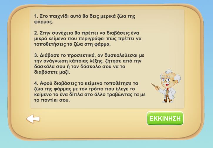
| 19 | Spatial navigation has been used | The spatial navigation has been used guideline suggests that spatial navigation should be used in a website or application. Spatial navigation refers to the use of visual cues and layout to guide the user through the content and help them understand the relationships between different elements. This can be especially useful for complex or large websites or applications, as it can help users understand the structure and organization of the content and navigate more efficiently. To follow this guideline, designers and developers should consider using visual cues such as headings, subheadings, and white space to create a clear and logical hierarchy for the content. They should also consider the layout and positioning of elements on the page, as this can help create a more intuitive and user-friendly experience for users. By using spatial navigation in a website or application, you can improve the usability and user experience of the content and make it easier for users to understand and navigate through the content. |

|
http://digi-ageing.eu/ | no |