 Graphical Representation
Description
Visual design is analyzed according to dynamic visual images, semiotics, and interaction. The analysis of visual design provides structure aimed at showing how games attribute aesthetical value to gameplay and how elements of visual design and game design combine their inherent qualities to form a game.
Guidelines
| # | Guideline | Description | Example | Example reference | Applied to Readistance |
|---|---|---|---|---|---|
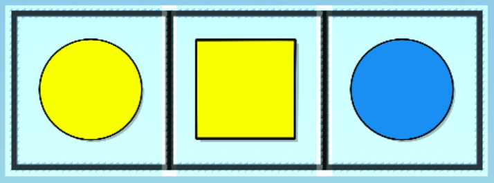
| 1 | Vivid colours and shapes have been used | The Vivid colours and shapes have been used guideline refers to the use of bright, bold, and distinct colours and shapes in design. This can help to attract attention, create visual interest, and make a design more visually appealing. Vivid colours and shapes can also be used to convey a particular mood or message, or to draw attention to specific elements of a design. When using vivid colours and shapes in design, it is important to use them in a way that is harmonious and balanced, and to consider how they will be perceived by the intended audience. |
|
http://www.cs.ucy.ac.cy/projects/readistance | yes |
| 2 | The use of text has been avoided as much as possible | The use of text has been avoided as much as possible guideline suggests that designers should minimize the use of written words in their designs, and instead rely on visual elements such as colors, shapes, and images to convey meaning and information. This can help to make the design more visually appealing and easier to understand, as viewers are often more drawn to and better able to process visual information than written words. Additionally, using fewer words in a design can make it more versatile and flexible, as it can be understood and interpreted by a wider audience, regardless of language barriers. It is important to use text sparingly and only when necessary, as including too much text can make a design cluttered and overwhelming. |
|
https://www.cartoonnetworkhq.com/games/teen-titans-go-summer-games/play | no |
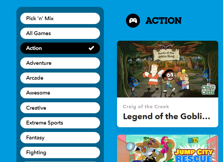
| 3 | The use of extensive menus and sub-menus has been avoided | The use of extensive menus and sub-menus has been avoided guideline suggests that designers should minimize the use of complex navigation structures in their designs, such as long lists of menu options or deep hierarchies of sub-menus. This can help to make the design simpler, more intuitive, and easier to use, as it reduces the number of steps that users need to take in order to find the information or features they are looking for. Using a more streamlined and straightforward navigation structure can also help to keep users focused on the task at hand, rather than getting lost or distracted in a maze of menus and sub-menus. It is important to strike a balance between providing sufficient options and features for users, and keeping the design clean and uncluttered. |
|
https://www.cartoonnetworkhq.com/games/category/action | yes |
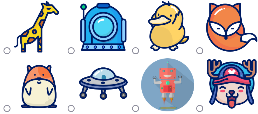
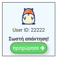
| 4 | Icons used are visually meaningful to children | The icons used are visually meaningful to children guideline suggests that designers should use icons or symbols in their designs that are easily recognizable and intuitive to children. This can help to make the design more accessible and easier for children to understand and use. Using icons that are visually meaningful to children means that they should be simple, clear, and easy to interpret, and should use colors and shapes that are familiar and appealing to children. It is also important to consider the cultural and developmental appropriateness of the icons, as children from different cultures and age groups may have different levels of familiarity with different symbols and visual languages. By using icons that are visually meaningful to children, designers can create designs that are engaging and intuitive for young users. |
|
http://www.cs.ucy.ac.cy/projects/readistance | yes |
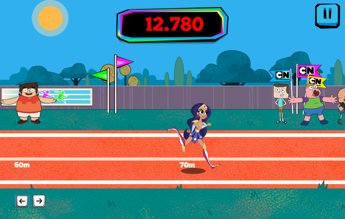
| 5 | Immediate graphical feedback is given showing that actions have had some effect | The immediate graphical feedback is given showing that actions have had some effect guideline suggests that designers should provide users with immediate and clearly visible feedback when they interact with a design, such as clicking on a button or selecting an option. This can help to confirm that the action has been registered and that the design is functioning as expected. Providing immediate graphical feedback can also help to create a sense of responsiveness and interaction in the design, which can be particularly important for engaging and maintaining the attention of users. This can be achieved through the use of visual cues such as animation, highlighting, or changes in color or size. It is important to ensure that the feedback provided is clear, relevant, and appropriate for the action taken by the user. |
|
http://www.cs.ucy.ac.cy/projects/readistance | yes |
| 6 | Content-specific metaphors have been used to assist player’s navigation between the interfaces | The content-specific metaphors have been used to assist player's navigation between the interfaces guideline suggests that designers should use metaphors in their designs that are based on the specific content or theme of the design, in order to help users navigate between different interface elements or screens. A metaphor is a figure of speech that describes one thing in terms of another, by implying a comparison between the two. Using content-specific metaphors can help to make a design more intuitive and easier to understand, as it provides users with familiar and relatable frame of reference for interacting with the design. For example, a design for a gardening game might use the metaphor of a garden map to help users navigate between different areas of the game, while a design for a cooking game might use the metaphor of a recipe book to help users access different dishes and ingredients. It is important to choose metaphors that are relevant, appropriate, and clear for the specific content and audience of the design. | — | — | no |
| 7 | Consistency on items has been applied | The consistency on items has been applied guideline suggests that designers should maintain consistency in the design elements that are used throughout a product or interface. This can help to create a sense of coherence and unity in the design, and can make it easier for users to understand and use. Consistency can be achieved through the use of consistent visual elements such as colors, fonts, and layout, as well as through the use of consistent behaviors and interactions. For example, if a button is used to initiate a certain action in one part of the interface, it should be used consistently in this way throughout the rest of the interface. Maintaining consistency can also help to establish a clear design language and identity for the product or brand. It is important to balance the need for consistency with the need for flexibility and creativity in the design. |
|
http://digi-ageing.eu/ | no |
| 8 | Consistency on item position has been applied | The consistency on item position has been applied guideline suggests that designers should maintain consistency in the positioning of design elements within a product or interface. This can help to create a sense of organization and structure in the design, and can make it easier for users to understand and use. Maintaining consistency in item position can be achieved through the use of consistent layout patterns and grids, as well as through the use of consistent alignment and spacing between elements. For example, if a particular type of item is always placed in the upper left corner of a screen or interface, it should be consistently positioned in this way throughout the rest of the interface. Consistency in item position can also help to establish a clear hierarchy and visual order in the design, and can make it easier for users to scan and locate items. It is important to balance the need for consistency with the need for flexibility and creativity in the design. |

|
http://digi-ageing.eu/ | no |
| 9 | Consistency on item order has been applied | The consistency on item order has been applied guideline suggests that designers should maintain consistency in the order in which design elements are presented within a product or interface. This can help to create a sense of predictability and logical flow in the design, and can make it easier for users to understand and use. Maintaining consistency in item order can be achieved through the use of consistent sequences and patterns, as well as through the use of consistent grouping and arrangement of elements. For example, if a particular type of item is always presented before another type of item in a list or menu, it should be consistently positioned in this way throughout the rest of the interface. Consistency in item order can also help to establish a clear hierarchy and structure in the design, and can make it easier for users to scan and locate items. It is important to balance the need for consistency with the need for flexibility and creativity in the design. | — | — | no |
| 10 | Simple and intuitive menus have been used | The simple and intuitive menus have been used guideline suggests that designers should create menus that are easy to understand and use, and that do not require any specialized knowledge or training. A simple and intuitive menu should be arranged in a clear and logical way, with options presented in a straightforward and easy-to-understand format. It should use familiar and recognizable icons or labels to represent the different menu options, and should group similar or related options together. The menu should also use visual cues such as highlighting, color, or size to indicate which option is currently selected, and should provide clear and concise instructions or explanations for each option. Overall, the goal of a simple and intuitive menu is to make it easy for users to find and access the options and features they need, without becoming confused or frustrated. |
|
http://www.cs.ucy.ac.cy/projects/readistance | yes |
| 11 | Rollover audio, animation, and highlighting has been used for a better functionality indication | The rollover audio, animation, and highlighting has been used for a better functionality indication guideline suggests that designers should use visual and audio cues such as rollover effects, animation, and highlighting to indicate the functionality of different interface elements. This can help to make the design more interactive and engaging, and can also make it easier for users to understand and use. Rollover effects are visual changes that occur when the user moves their cursor over an interface element, such as a button or menu option. These effects can include changes in color, size, or shape, as well as the display of additional information or instructions. Animation is the use of movement or change in a design, such as the movement of an object or the transition between different screens or states. Highlighting is the use of emphasis or emphasis on a particular element or area of the design, such as by using a different color or bolding the text. By using rollover effects, animation, and highlighting, designers can provide users with clear and immediate feedback on the functionality of different elements, and can create a more interactive and engaging experience. |
|
http://www.cs.ucy.ac.cy/projects/readistance | yes |
| 12 | Icons based on familiar concepts have been used | The icons based on familiar concepts have been used guideline suggests that designers should use icons or symbols in their designs that are based on familiar and recognizable concepts or objects. This can help to make the design more intuitive and easier to understand, as it provides users with a familiar frame of reference for interpreting the meaning of the icons. Familiar concepts can include everyday objects, such as a trash can icon to represent the delete function, or familiar actions, such as a backward arrow icon to represent the back or undo function. Using icons based on familiar concepts can help to create a sense of familiarity and ease of use in the design, particularly for users who may not be familiar with the specific terminology or language used in the interface. It is important to choose icons that are clear, relevant, and appropriate for the specific content and audience of the design. |
|
http://digi-ageing.eu/ | no |
| 13 | Icons do not distract the player from the main task | The icons do not distract the player from the main task guideline suggests that designers should ensure that the icons or symbols used in a design do not distract or divert the user's attention away from the primary task or goal of the design. This can help to keep the user focused and engaged, and can also help to prevent confusion or frustration. In order to avoid distracting the user, the icons should be used sparingly and only when necessary, and should be placed in a location that is appropriate and unobtrusive. The icons should also be clearly and accurately labeled, and should be easy to understand and interpret. By using icons in a way that does not distract the user, designers can help to create a design that is efficient and effective at achieving its intended goals. |
|
http://www.cs.ucy.ac.cy/projects/readistance | yes |
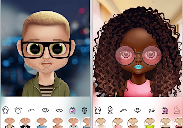
| 14 | Player has the ability to customize the cartoon art | The player has the ability to customize the cartoon art guideline suggests that designers should allow users to personalize or customize the cartoon art or graphics used in a design. This can help to make the design more engaging and interactive, and can also allow users to express their creativity and individuality. There are many different ways that users might be able to customize cartoon art, such as by choosing from a selection of pre-made art assets, or by using tools or controls to create their own custom art. It is important to consider the range and complexity of customization options that are appropriate for the specific audience and purpose of the design. By giving users the ability to customize the cartoon art, designers can create a design that is more personalized and engaging for each individual user. |
|
Dollicon Game | no |
| 15 | In-game communication is fast and comprehensible | The in-game communication is fast and comprehensible guideline suggests that designers should ensure that the communication and messaging systems used within a game are fast and easy to understand. This can help to create a smooth and seamless gaming experience, and can also help to keep players engaged and immersed in the game. In-game communication might include various types of messages or notifications, such as alerts, instructions, or updates on the game state or progress. It is important to design these communication systems in a way that is efficient and easy for players to understand, and that does not interrupt or disrupt the flow of gameplay. This might involve using clear and concise language, as well as appropriate visual and audio cues to convey the message. By designing fast and comprehensible in-game communication systems, designers can create a more engaging and enjoyable gaming experience. | — | — | no |
| 16 | In-game communication has been applied using a graphical representation | The in-game communication has been applied using a graphical representation guideline suggests that designers should use visual elements, such as images or graphics, to communicate information or messages to players within a game. This can help to make the communication more engaging and interactive, and can also make it easier for players to understand and interpret the information being conveyed. Using a graphical representation for in-game communication might involve displaying images or icons to represent different actions or states, or using animation or visual effects to convey messages or instructions. It is important to choose graphics that are clear, relevant, and appropriate for the specific content and audience of the game, and to use them in a way that is efficient and effective at conveying the intended information. By using graphical representation for in-game communication, designers can create a more immersive and engaging gaming experience. | — | — | no |
| 17 | Interfaces provide guidance on task accomplishment | The interfaces provide guidance on task accomplishment guideline suggests that designers should design interfaces in a way that helps users understand and accomplish the tasks that are required of them. This can involve providing clear and concise instructions or explanations for each task, as well as using visual cues such as highlighting or animation to guide users through the steps of the task. Providing guidance on task accomplishment can help to make the interface more user-friendly and easy to use, and can also help to reduce the risk of confusion or frustration for users. It is important to consider the needs and abilities of the specific audience for the interface, and to provide guidance that is appropriate and relevant for that audience. By designing interfaces that provide guidance on task accomplishment, designers can create a more intuitive and efficient user experience. |
|
http://www.cs.ucy.ac.cy/projects/readistance | yes |
| 18 | Interfaces display the history of the player’s exploration of environments | The interfaces display the history of the player's exploration of environments guideline suggests that designers should design interfaces that allow users to view and track their progress or history within a game or virtual environment. This can involve displaying information such as the locations visited, items collected, or objectives completed by the player. Displaying the history of the player's exploration can help to create a sense of accomplishment and progress, and can also provide users with a reference point for future exploration. It is important to consider the appropriate level of detail and complexity for displaying the history of the player's exploration, and to design the interface in a way that is clear and easy to understand. By including a feature for displaying the history of the player's exploration, designers can create a more immersive and engaging gaming experience. |
|
http://www.cs.ucy.ac.cy/projects/readistance | yes |
| 19 | Illustrations have been preferred over text | The illustrations have been preferred over text guideline suggests that it is generally better to use illustrations rather than text to communicate information in children's games. This is because children may not have the same level of reading comprehension as adults, and may find it easier to understand information that is presented visually rather than through text. There are a few ways that you can use illustrations effectively in children's games: 1. Use illustrations to convey important information: Instead of using text to explain a concept or task, consider using illustrations to show what is happening. This can be especially effective for younger children who may not be able to read yet. 2. Use illustrations to make the game more visually appealing: Children are often drawn to bright, colorful, and visually appealing games. By using illustrations rather than text, you can create a more visually engaging experience for children. 3. Use illustrations to reinforce learning: Illustrations can be a useful tool for reinforcing concepts and ideas that children are learning about. For example, if you are teaching children about different types of animals, you could use illustrations of each animal to help them learn and remember the names. By using illustrations effectively in children's games, you can create a more enjoyable and engaging experience for children, and help them learn and retain important information. | — | — | no |
| 20 | Headings, Titles and prompts have been used | The headings, titles, and prompts have been used guideline suggests that it is important to use headings, titles, and prompts to help children understand and navigate a game. Here are a few ways that these elements can be used effectively in children's games: 1. Use headings to divide content into logical sections: Headings can be used to divide the content in a game into different sections, making it easier for children to understand and navigate. 2. Use titles to give children an overview of what they will be doing: Titles can be used to give children an idea of what they will be doing in a game, and can help them understand the purpose of the game. 3. Use prompts to guide children through the game: Prompts can be used to give children instructions or hints about what they should do next in the game. This can be especially useful for younger children who may need more guidance. By using headings, titles, and prompts effectively in children's games, you can help children understand and navigate the game, and create a more enjoyable and engaging experience. |
|
http://digi-ageing.eu/ | no |
| 21 | Support screen readers have been used | The support screen readers have been used guideline is especially important when building children's games, as children with visual impairments should be able to access and play the game just like any other child. To support screen readers when building children's games, you should follow the same best practices that are used when building any website or application. This may include: 1. Using semantic HTML tags: Semantic HTML tags, such as for headings andfor paragraphs, help screen readers understand the structure and content of a webpage. 2. Providing alt text for images: Alt text is a text description of an image that is displayed if the image cannot be shown. Providing alt text for images allows screen readers to describe the content of the image to the user. 3. Using descriptive link text: Rather than using click here or read more for link text, use descriptive text that explains what the user will find when they click the link. This helps screen readers understand the purpose of the link. By following these best practices, you can ensure that your children's game is accessible to users with visual impairments and can be played with screen reader software. |

|
http://www.cs.ucy.ac.cy/projects/readistance | yes |
| 22 | Simple screen layout has been used | The simple screen layout guideline suggests that it is important to use a simple and uncluttered layout when building children's games. This can help reduce distraction and make the game easier for children to understand and navigate. Here are a few ways to create a simple screen layout for children's games: 1.Use a limited number of colors: Using a limited color palette can help create a cohesive and uncluttered look for the game. 2.Use plenty of white space: White space is the empty space on the page that surrounds the content. Using plenty of white space can help create a clean and uncluttered look for the game. 3.Use clear and concise text: Children may not have the same reading comprehension skills as adults, so it is important to use clear and concise text that is easy for them to understand. 4.Use simple and intuitive navigation: Children should be able to easily understand and navigate the game, so it is important to use simple and intuitive navigation. By following these guidelines, you can create a simple and uncluttered screen layout that is easy for children to understand and navigate. | — | — | no |
| 23 | Wide margins have been used for maintaining white space | The wide margins have been used for maintaining white space guideline suggests that wide margins should be used to create plenty of white space around the content on a webpage or application. White space is the empty space on the page that surrounds the content, and it can help create a clean and uncluttered look for the webpage or application. Using wide margins to create white space can have several benefits: 1. Improved readability: Wide margins can help create a more spacious and open look for the webpage or application, making it easier for users to read and understand the content. 2. Increased aesthetic appeal: Wide margins can create a more visually appealing look for the webpage or application, making it more attractive to users. 3. Improved usability: Wide margins can help create a more intuitive and user-friendly layout for the webpage or application, making it easier for users to navigate and interact with the content. To follow this guideline, you should use wide margins around the content on your webpage or application to create plenty of white space. This will help create a clean and uncluttered look for the webpage or application, and improve the overall user experience. | — | — | no |
| 24 | Basic buttons are displayed on every page (e.g., exit, home, help) | The basic buttons are displayed on every page guideline suggests that certain buttons, such as an exit button, a home button, and a help button, should be displayed on every page of a children's game. These buttons can help children navigate the game and provide them with access to important information and assistance. Here are a few considerations for using basic buttons in children's games: 1. Make the buttons easy to find: Children should be able to easily locate the basic buttons on every page of the game. This may mean placing the buttons in a consistent location on each page, or using a distinctive design for the buttons. 2. Use clear and concise labels: Children may not have the same reading comprehension skills as adults, so it is important to use clear and concise labels for the buttons that are easy for them to understand. 3. Consider the needs of the target audience: Different age groups may have different needs when it comes to basic buttons. For example, younger children may need more assistance, so a help button may be more important for them. By following these guidelines, you can effectively use basic buttons in children's games to improve navigation and provide access to important information and assistance. | — | — | no |
| 25 | Contrast is noticeable from the use of colours | The contrast is noticeable from the use of colors guideline suggests that the use of different colors can help create contrast and improve the visual appeal and usability of a website or application. By using colors that have a high contrast ratio, designers and developers can create a more visually appealing and user-friendly experience for users. A high contrast ratio means that there is a significant difference in the brightness and/or saturation of the colors being used. For example, using a dark blue for text on a light yellow background would have a high contrast ratio, making the text easier to read. On the other hand, using a light blue for text on a pale yellow background would have a low contrast ratio, making the text more difficult to read. By using colors with a high contrast ratio, designers and developers can create a more visually appealing and user-friendly experience for users. | — | — | no |